
Analyzing Survey Responses
"Rate the following statements to the best of your ability"
Post-Semester Survey Questions
Survey Design
Students in six different calculus courses taught by three different professors at Appalachian State University during the Fall 2016 semester were asked to voluntarily and anonymously complete two online surveys: one at the beginning of the semester, and one at the end. 82 students completed the pre-semester survey, and 99 students completed the post-semester survey. As the survey was anonymous, we were not able to pair answers and to test for difference of proportion, so we can only make claims about a general shift in the answers of this group of students.
A total of eight questions on the post-semester survey closely paralleled the pre-semester survey questions. In each of these questions, we asked students to rank statements on a seven-point Likert Scale (Strongly Disagree to Strongly Agree). We were able to run a Monte Carlo simulation -- essentially the exact same test as a Chi-Square Homogeneity test, but usable after conditions for Chi-Square have failed -- to analyze any difference in the distribution of student answers across the semester. With tests that come out significant, we are able to conclude that there was a change in distribution of student answers between the surveys, and we can use visuals such as bar charts to further examine that change. All conclusions will be made about this particular group of students, and any significant changes will encourage future research rather than claiming something about a population.
Tables of counts and bar charts of percentages are both provided and discussed in this section of the website. The table of counts were used for the Monte Carlo simulations to claim significance of difference, while bar charts are provided as a visual for looking at differences among this group of students.
This section also includes an analysis of questions asked only on the post-semester survey that did not line up with anything asked on the pre-semester survey. Although nothing significant can be concluded from these questions about changes in student perception over the semester, we are interested to further examine their answers! These questions will be included at the bottom of this section, after discussion of the eight parallel questions included on both surveys.
Click on the buttons below to jump through the analysis of survey topics, or simply read through this page!
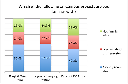
Question Two: Familiarity with On-Campus Projects
This question aimed to analyze whether students had learned about any on-campus renewable energy projects throughout the semester. Two of the projects were specifically mentioned in our questions (the photovoltaic array in Legends parking lot and the Broyhill wind turbine) while the other is merely a distinguishable PV array in the Raley traffic circle.
Note the following:
-
About a quarter of the students surveyed still are not familiar with either the Broyhill Turbine or the Legends Charging Station!
-
Since around 24% of students learned about each of these projects this semester, we cannot claim that introducing these projects in our problem had any affect on the students' knowledge of on-campus projects.
Question One: Familiarity with Terms
The goal of this question was to identify if students learned any terms we had introduced in their calculus problems throughout the semester. We included five terms: two terms we had defined explicitly in a calculus problem (sea ice extent and water runoff), and three terms were discussed generally in the problems but never explicitly defined (carbon footprint, water footprint, impervious surfaces).

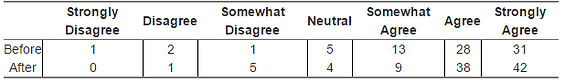
Question Eight: Perception of Where the United States Stands
Pre-Semester Survey: “As a whole, the United States is living sustainably”
Post-Semester Survey: “As a whole, the United States is living sustainably”

Question Eight aimed to analyze any shift in how students perceived the United State's commitment to sustainability. Our hope was that after attending one of the leading sustainability universities in the nation for a semester, this group of students would recognize that the U.S. still has a long way to go in the movement towards a more sustainable future. The counts for both surveys can be seen in the table above.
Running a Monte Carlo simulation on this question yielded a p-value of .3423 -- Thus, we cannot conclude that there has been a change in the distribution of student answers over the course of the semester. Still, let's visually examine the difference in student answers through a few bar graphs.
Note the following:
-
Looking at the combined counts, note that about 10% fewer students disagreed with the statement.
-
Those 10% of students shifted to agreeing with the statement.
-
Somehow, after the semester, more of the sampled students agree that the United States is living sustainably.
-
It is interesting that more students in the sample feel comfortable in their understanding of 'sustainable living,' yet less of these same students disagree that the United States is living sustainably.
Question Seven aimed to analyze if students felt that they gained understanding about sustainable living throughout the semester. Our hope was that students would be more comfortable in their understanding of sustainability simply by attending one of the nation's leading universities in sustainability. The counts for this question across both surveys can be seen in the table above.
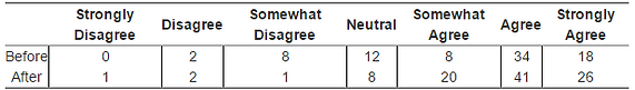
Question Seven: Student Understanding of Living Sustainably
Pre-Semester Survey: “I feel as though I fully understand what ‘sustainable living’ means”
Post-Semester Survey: “I feel as though I fully understand what ‘sustainable living’ means”

Running a Monte Carlo simulation on the table yielded a value of 0.096 -- Thus, we are relatively confident (at the 90% confidence level) that there has been a change in the distribution of student answers between the two surveys. Since we do not have extreme confidence that there was a change in distribution, we will have to carefully examine the visuals below.
Note the following:
-
The percentage of students who "Agree" and "Strongly Agree" that they fully understand what sustainable living is has gone up over the semester.
-
The percent of students who disagree to any extent has gone down by roughly 10% (this drop is easier to see on the combined graph).
-
The percent of students who are neutral with the statement has gone up by under 5% over the course of the semester.
-
The percent of students who agree to any extent has increased by a little over 5% over the course of the semester.
Conclusion: This group of students left the semester feeling a little bit more comfortable in their understanding of sustainable living.
Question Six: Recognizing the Association between Math and Sustainability
Pre-Semester Survey: "Math is associated with sustainability"
Post-Semester Survey: "Math is associated with sustainability"
Question Six aimed to analyze any difference in student perception of the relationship between math and sustainability. Our hope was that, after introducing sustainabiliy-related calculus questions throughout the semester, more students would realize that there is a relationship between the two fields. The counts for students across both surveys can be seen above.
Note the following:
-
The percentage of students who answered "Somewhat Agree" and "Strongly Agree" has increased on the post-semester survey.
-
All of the "Disagree" and "Neutral" statements have gone down on the post-semester survey.
-
Looking at the combined graph shows us that about 15% more students agree with the statement that math is associated with sustainability at the end of the semester than at the beginning.
Running a Monte Carlo simulation on the frequency table yields a p-value of 0.029. Thus, we can reject the null hypothesis at the 95% confidence level that the distribution of student answers is the same across both tests and conclude that there has been some shift in student answers across the semester. Let's look at the visuals above to explore that change further.
Conclusion: More students agree that sustainability is related to math after taking this course.
Question Five: Student Commitment to Sustainability
Pre-Semester Survey: "Living sustainably is something I care about"
Post-Semester Survey: "Living sustainably is something I care about"
Question Five aimed to analyze whether there was any difference in student commitment to sustainability over the semester. Our hope was that students coming out of the semester would care more about living sustainably than the same students going in. Counts for this question can be seen in the table above.
Running a Monte Carlo Simulation on this table yielded a p-value of 0.4063 -- Thus, we can NOT conclude with any confidence that the distribution of student answers has changed over the course of the semester. Still, let's look at a few bar charts to further explore student answers.
Note the following:
-
The percentages of students answering "Agree" and "Strongly Agree" have gone up slightly over the course of the semester (less than 5% each).
-
It is a bit easier to see in the combined counts that there was not much of a change over the course of the semester for any of the three categories (Disagree, Neutral, Agree).
-
However, about 90% of the students surveyed both before and after the semester agreed that they care about living sustainably. That is pretty awesome!
Question Four aimed to analyze the difference in student perception about the usefulness of math over the course of the semester. Our hope was that by including more real-life examples and applications, students would be able to see how useful math can be in the real world. The counts of students for each survey can be seen in the table above.

Running a Monte Carlo Simulation on this table yielded a p-value of 0.4148 -- Thus we can NOT conclude that the distribution of students answers among the Likert Scale has changed over the course of the semester. Although our test was not significant, let's examine the answers a bit further with some visuals:
Note the following:
-
We can see that the percentages of students who "Agree" and "Strongly Agree" that math is useful have gone up by about 5% and 10%, respectively
-
On the combined counts, we see that "Agree" has slightly increased, while "Disagree" and "Neutral" have very slightly decreased
-
There was not a statistically significant change over the course of the semester, but we see that the percentage of students who agree that math is useful has gone up by a little under 10%, and that is good enough for us!
Question Four: Math Seen as Useful
Pre-Semester Survey: "I feel as though the math I am learning is useful"
Post-Semester Survey: "I feel as though the math I learned this semester was useful"
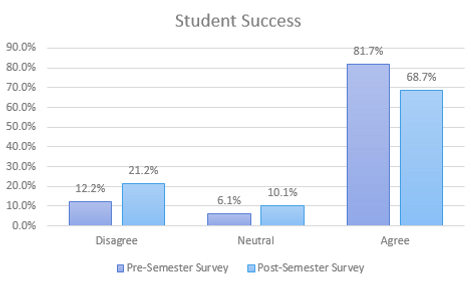
Conclusion: Students were generally less successful in this math course than they were in previous math courses.
Question Two: Student Success
Pre-Semester Survey: "I have been successful in my previous math courses"
Post-Semester Survey: "I was successful in this math course"

Our hope for Question Two was that students would be more successful in this math course than they had been in previous math courses. The counts of students for each survey can be seen in the table above.
Running a Monte Carlo Simulation on this table yielded a p-value of 0.08346 -- Thus, we can conclude with 90% confidence that there is a difference in the distribution of student answers for this question between surveys. That is, there has been some change in student answers of whether or not they were successful in this course as compared to previous math courses. To examine that change further, let's look at the bar chart of percentages to our right.
Note the following:
-
The only percentage that went down on the post-semester survey was the percentage of students who "agreed" that they were successful in this course. The percentage of students in all other categories went up. It is a little bit difficult to see exactly what is changing the most in this graph, so let's combine all "disagree" statements and all "agree" statements.
-
Now that we have combined our statements, it is much easier to see that the percentage of students who agreed that they were successful in this course is about 10% lower than the percentage of students who agreed on the pre-semester survey that they have been successful in their previous math courses.
-
The percent of students who disagreed that they were successful in this course is about 10% higher than the percent of students who disagreed that they were successful in previous math courses.
-
It is interesting that students were generally more satisfied with this course than in previous math courses but were generally less successful in this course than in previous courses.

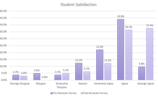
Question One: Student Satisfaction
We hoped that through Question One, we would see students leaving this math course feeling more satisfied than they had left previous math courses feeling. The counts of students who fell under each category can be seen in the table above.

Pre-Semester Survey: "I have been satisfied with the math courses I have taken previously"
Post-Semester Survey: "I have been satisfied with this math course"
Note the following:
-
The percent of students who strongly agreed that they were satisfied in this math course is over 25% higher than the percent of students who strongly agreed that they were satisfied with math courses taken previously.
-
After lumping the categories together into "Agree," "Neutral," and "Agree," it is a bit easier to see that the percent of students who generally agreed that this math course was satisfying is larger than the percent of students who were satisfied with previous math courses by about 10%.
-
Less students disagree that this math course was satisfying than students who disagreed that previous math courses were satisfying.
Running a Monte Carlo Simulation on the frequency table yielded a p-value of 0.0009 -- Thus, we can conclude with confidence that there is a difference in the distribution of student answers on this question between the pre-semester and the post-semester survey. That is, there has been some change in student satisfaction of math courses over the semester.
Let's examine the change a bit further by looking at the bar chart to our left.
Conclusion: For the most part, this math course was more satisfying to students than previous math courses were.

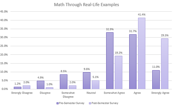
Question Three: Math Through Real-Life Examples
Pre-Semester Survey: "Math concepts have been explained to me through real-life examples"
Post-Semester Survey: "Math concepts have been explained to me through real-life examples"

Through Question Three, we hoped to see a large percentage of students agreeing that math had been shown to them through real-life examples on both surveys, but we would be happy as long as we saw a large percentage of students agreeing that they had seen math explained to them through real-life examples after taking this course. The counts of student responses can be seen in the table to the left.
Note the following:
-
The percentage of students who strongly agreed that math has been shown to them through real-life examples has increased by almost 20% over the course of the semester!
-
Looking at the second graph shows that the percent of students who generally agreed that math has been shown to them through real-life examples increased by almost 15% over the course of the semester.
-
The percentage of students who generally disagreed that math has been shown to them through real-life examples has decreased by about 10% over the course of the semester.
Running a Monte Carlo Simulation on this table yielded a p-value of 0.0015 -- Thus we can conclude with extreme confidence that the distribution of students answers among the Likert Scale has changed over the course of the semester. Let's examine this change further with the bar graphs below.
Conclusion: More students agree that math has been shown to them through real-life examples after taking this course.


Note the following:
-
"Surface Runoff" has a very similar distribution to "Carbon Footprint." Almost two-thirds of the students surveyed were already familiar with each of these terms!
-
"Sea Ice Extent" has a very similar distribution to "Water Footprint." A little over half of the students surveyed were already familiar with these terms, while about a quarter of the students surveyed learned each of these terms over the course of the semester.
-
Since the terms explicitly discussed in the problems have similar distributions to problems that we did not explicitly discuss, we cannot claim that anything we did had an affect on the students learning new sustainability terms.
Question Three: Would You Like to Learn More?

Question Four: Want to See More?

Question Five: Which Did You Prefer?


This question was geared towards future research. The whole point of this project was to combine sustainability and calculus into something interesting and engaging for the students. We were curious to know if future students might enjoy more problems shaped around renewable energy projects on their campus.
Note the following:
-
43.5% of the students surveyed agreed to some extent that they enjoyed the sustainability questions more than general calculus applications. That is a really exciting statistic!
-
Only 14.2% of students disagreed to some extent that they enjoyed sustainability questions more.
Of course, we were curious whether students enjoyed the experience at all!
Over half of the students surveyed would like to see more of these problems! This is honestly pretty exciting considering how apathetic most students in college math can be.
Since almost half of the students surveyed would be interested to learn more about on-campus sustainability projects, we will likely include them in future problems!
Towards the end of creating all of these calculus problems, we hypothesized that students might be more engaged in problems that specifically dealt with Boone. We began to mention Boone and ASU specifically in our last few problems
Note the following:
-
Over half of the students surveyed agreed to some extent that they enjoyed questions related to Boone more than the general sustainability questions! That is a large enough percentage to put more effort into creating future problems specifically dealing with Boone.